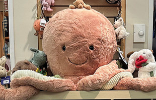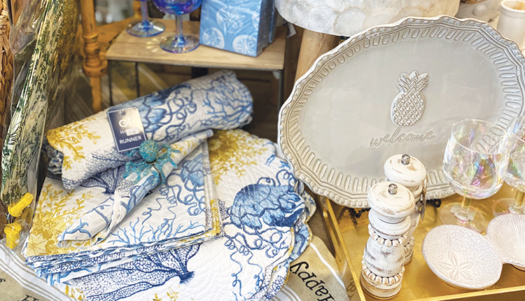
Elaborate-themed displays behind the storefront glass at Gumbo Limbo Coastal Chic and Coastal Kidz in historic Stuart, Florida, entice passersby to stop in and explore what’s inside. “The window is like an introduction — a handshake, a ‘Hello, we’d like you to come inside,’” says owner Patty O’Connell. “When a window catches your eye, even if it’s not something you’re looking for, you might just stop in.”
From there, a “meandering flow” with thoughtfully placed, heavily merchandised displays offers customers a feast for the eyes and senses. Presentations by color, category and product theme — always organized and tidy — allow guests to naturally walk the floor plans of the two connected stores.
And for O’Connell, creative touches like a full-size she shed and repurposed antique furniture add character. In a sense, O’Connell takes a window display approach to her shop’s presentation. “I really look at each individual display that I’m working on as its own entity,” she says. “I try to tell a story.”
All about adjacency
Adjacency is connection. It’s how products relate and flow together from one category to the next. “It means placing your product categories in a way that will encourage customers to move from one section to the next seamlessly, without jarring their senses,” says Natalie Tan, Seaside Retailer columnist, retail consultant and an instructor of retail merchandising and display strategies at the British Columbia Institute of Technology School of Business.
The fact is, when you’re operating a shop that you know inside and out, chaos can go unnoticed. Plus, the multitasking nature of running a gift shop can often distract well-intentioned owners from thoughtful product placement, Tan says.
“As a store owner, you’re the manager, the trash collector and everything else in between, and when more shipments come in, you put it where there’s space and figure you can just move it later,” she says.
In addition to advancing sales, effective adjacency facilitates smart buying.
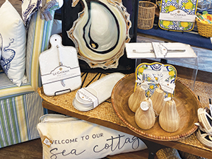
“Having a home in your shop for every category allows you to gauge how much product you need to buy,” Tan says.
Selling points
The primary purpose of adjacency strategies is to increase sales. “It’s easier to sell three items to one person than it is to sell one item to three different people,” Tan points out. “So, cashing in on that is the idea that if you offer a product to customers that is something related to what they are interested in buying, they’re more likely to be open to that suggestion.”
Adjacency can help accomplish suggestive selling with visual presentation. “Not everyone is good at saying, ‘Would you like a beach bag to go with that?’” O’Connell says. She trains shop staff to identify complementary items for customers, but following through is easier for some than others. With successful adjacency, there’s no verbal pitch required.
But when products lack flow, achieving a multi-item basket is more challenging. “If someone is looking at jeans and you say, ‘By the way, we have tops on the other side of the store,’ it’s not as easy of a sell,” Tan relates.
Pam White owns Nellie and Lo, a gift shop in Mount Pleasant, South Carolina, with her daughter Taylor Socci. The store is geared toward repeat customers who live in the area — accessible to downtown Charleston and situated on the Waterfront at Shem Creek. Nellie and Lo opened in October 2020 amid the pandemic and has grown a loyal local following, White says.
As for display adjacency, the mother- daughter duo have learned a few lessons about what sparks sales. “One thing we try not to do is fill baskets on the floor. Then you start building away from shelves and that just clutters the space,” White says.
Nellie and Lo limits basket items, and any product selected for a lower display must have eye-catching packaging or be interesting enough to grab attention. For example, White might position puzzles in brightly colored boxes on low shelves. “Also, we sell these soap rocks that are so pretty, how they sit and how they look. People are intrigued and will reach down to pick one up to see what it is,” she says.
Get the house in order
You might be missing out on additional sales if customers frequently ask you where to find this or that. And if you realize that areas of the shop are untouched, that’s another sign that a re-org is in order. So, where to start?
Tan likes to begin store layout and planning consultations by assigning a color to every type of product. For example, swimsuits are pink, beach accessories are blue, home decor for the kitchen is red, decor for the living room is purple, women’s apparel is yellow and so on. Then she draws a store map of how merchandise is displayed and places the corresponding colored stickers on the paper.
“Then you can see, ‘My store is a mess because I have colors everywhere,’” she relates. “We then discuss how to arrange it so colors are together.”
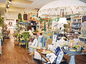
With a store category approach, which is how department stores are arranged, Tan takes displays from a macro and then micro approach. There are categories (groupings) and subcategories of product types. For example, umbrella categories might be apparel, home decor and accessories. Then subcategories might include men, women and children under apparel — and outdoor/indoor home decor. Another sub-category of home decor might be tableware.
From there, consider how customers associate different product groups. For example, someone looking for a bathing suit might also want a beach towel so these categories should be placed near each other. A customer who comes into a shop looking for beachy tumblers might also be interested in a charcuterie board or fun cocktail napkins.
As for housewares, “Most people like to shop the way they lay out their homes,” Tan says. “So, if I walk into the front door, the first thing I normally see is the living room where you receive visitors, and then adjacent to that is the dining room, and from there you have the kitchen.”
When a store feels like home, it offers a welcoming experience for guests. “You’re comfortable, relaxed,” Tan relates.
Collections by colorway
Another way of creating adjacencies is to arrange products of like colors together. Nellie and Lo feature tables offer an opportunity to entice customers with color. “One table is in springy colors and includes items from serving pieces to candles, and the middle table is blue and white, which is popular now and attracts a lot of people,” White says.
At Gumbo Limbo, blending colors within displays helps with store flow, O’Connell says. “People’s eyes go from one item to the next and they are intrigued,” she says. “I’m not afraid to put the Michel Design Works Ocean Tide Collection across from blues and grays.”
Tan says women tend to buy by color, particularly with apparel. “At home, you’d look at your wardrobe and see color groups, and when you go to a store, you’re looking around thinking, ‘I need something to go with this,’” she says.
Creating theme stories
A full-size 9-foot tall, 20-foot wide she shed at Gumbo Limbo offers an environment for specialized merchandising, whether holiday, spring or beach. “It’s literally a little house you can walk into,” O’Connell says.
In a children’s area, a tree house with a mannequin on a swing is dressed in clothing for sale. Toys and books are displayed. And placed next to it is boys’ and girls’ swimwear. “So you see a huge wall of swim, boys and girls, with lots of colors, and we merchandise that with beach bags, goggles, beach balls and appropriate toys,” O’Connell says.
A market umbrella positioned at the Gumbo Limbo store entrance creates a completely coastal zone. And artwork is a theme throughout the shop. Since 2008, Gumbo Limbo has sold more than 1,000 coastal pieces by Lori Lynn Art depicting scenes that incorporate turtles, pelicans, seahorses, octopuses and other marine life. These are displayed on walls and merchandised together, creating a flow throughout the store that connects the dots from an adjacency standpoint. Plus, it makes a visual brand statement about supporting local artists and entrepreneurs.
Grouping items by stories is an effective strategy for connecting customers to products that speak to them. Gift and souvenir shops can display groups for various demographics or by interest. For example, Tan shares how a shop created one story with nature-related items of all kinds, from apparel to decor, and another story based on art pieces. “That is one way of doing adjacencies,” she says.
Based on buyer behavior
Where do customers go first when they enter your shop? Buyer behavior is another way to establish adjacencies.
For instance, one store Tan consulted for received mostly female shoppers with full-time jobs. “So when they come into the store, the first thing they want to do is anything relaxing,” Tan says. “So we placed bath-and-body where they can smell those scents when they walk in, and then we pair those with accessories and other products they find relaxing.”
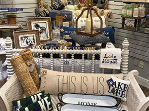
Meanwhile, customers looking for gifts tend to flock to the self-care area, where they will find hand creams, room sprays, bath bombs, body butters, shower gels and soaps. By grouping these items in an accessible space, “if someone is looking for a gift for the aunt they don’t know that well, we can direct them there.”
When customers are “on a mission” at Gumbo Limbo or Coastal Kidz, O’Connell says they can easily find the product type they are looking for because not only are displays arranged on furniture shelves that allow each item to have some breathing room, everything is always neat and tidy. That way, shoppers can see and select easily.
Cashing in at the register
Tan shares how as a manager for a casual fashion clothing store that sold mostly cotton goods, she placed socks in every color by the checkout area.
“We created a color wall of socks, and for every person buying a sweatshirt, we offered them socks in the same color,” she says. “Right then and there, our store was the No. 1 seller of socks, whereas socks are usually an afterthought.”
Again, this scenario supports how adjacencies boost sales.
At Nellie and Lo, placing jewelry close to the checkout desk allows staff to share information about the pieces while also ensuring that these items do not “walk out of the store,” White says.
Ultimately, adjacency is about guiding customers through the shop in a way that inspires them to find special items, perhaps more than they initially thought they’d purchase — and to return time and again to explore the inventory.
“We get a lot of customers who say, ‘There is so much to look at!’” O’Connell says. “That is one of the greatest compliments.”
