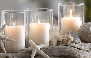
Many seaside retailers embrace colors of the ocean and sea, from blues and teals to greens and tans, but introducing other colors to tried-and-true coastal combinations is worth considering. When Pantone Color Institute announced its 2022 Pantone Color of the Year, Very Peri, some seaside retailers took notice.
“I post the Pantone Color of the Year each year on my social media pages and poll the interest from my customers in the newly selected color,” says Claudine Turbedsky, owner of Coastal Palms Boutique, Sea Isle City, New Jersey. “I don’t necessarily use the Color of the Year in my boutique for displays or themes, as my boutique is very bright and colorful. I’d rather use it as a guide in my buying selection of my spring and summer inventory, whether to incorporate it or not.”
Pantone describes the new Very Peri (official color Pantone 17-3938) as, “Blending the faithfulness and constancy of blue with the energy and excitement of red, this happiest and warmest of all the blue hues introduces an empowering mix of newness.”
“As we move into a world of unprecedented change, the selection of Pantone 17-3938 Very Peri brings a novel perspective and vision of the trusted and beloved blue color family,” says Leatrice Eiseman, executive director, Pantone Color Institute. “Encompassing the qualities of the blues, yet at the same time possessing a violet-red undertone, Pantone 17-3938 Very Peri displays a spritely, joyous attitude and dynamic presence that encourages courageous creativity and imaginative expression.”
So far, Turbedsky hasn’t seen much in the way of Very Peri color offerings in the curated brands and vendors she purchases from regularly. She is personally drawn toward brighter clothing and vibrant print selections that incorporate turquoise, coral, sea glass and other ocean-esque colors for her store that specializes in colorful clothing, vibrant resortwear, accessories and gifts with a “palm and beach flair and vibe.” She adds, “That doesn’t necessarily mean that Very Peri won’t surface in color schemes, store displays and clothing in other retail and fashion venues.”
Tapping into the trend
Color of the Year announcements mean more to some types of stores than others, points out Becky Tyre, retired retail consultant, shop local advocate and founder of the Retail Details podcast. Stores that specialize in home decor, jewelry, stationary and textiles are more likely to be focused on color trends than retailers that sell toys and souvenirs, she says.“Color is not just important for merchandise though,” Tyre says. “When a color is well received, it influences branding and packaging and can be used for such purposes as email blasts or website backgrounds to indicate a contemporary face for a company.”
“Seaside retailers who choose to embrace Very Peri will have no issue incorporating the color into their merchandise mix as it blends well with the traditional colors associated with sand, sea and sky,” she says.
If a retailer does not want to invest heavily in the Color of the Year, Tyre recommends a product mix table or display area.“This is where a single color is the theme of the display rather than type of merchandise,” she explains. “To achieve this, retailers should go around the store and pull any items with the color in the product or the packaging and group them all together in one area, making a color statement.”
Another tip: Look for the color in unintentional places, such as on the cover of a book, within a print pattern or on clothing.
If stores do not have a large enough offering in the chosen color for a product mix display, Tyre suggests setting aside a few items against a sea of neutral monotone products with the Color of the Year as a familiar pop-of-color type display.
Adding to the offerings
The Color of the Year was a major focus at February’s Atlanta Apparel with a Color of the Year install, a Pantone Party and a webinar.“Apparel is an industry that not only influences but is influenced by the Pantone Colors of the Year,” says Morgan Ramage, International Market Centers fashion director. “The Pantone Color Palette of the Year is one of the most powerful and trusted trend forecasting tools, and retailers rely on Atlanta Apparel as an educational authority. We provide detailed trend education through webinars and seminars and take the extra step of staging those trends to bring them to life and give retailers the full picture.”
And while designers and manufactures work to incorporate the new color into their offerings, some product makers are already on trend with their offerings.
Katheryn Casale, design manager for Sea Bags, a Maine-based company that makes nautically themed totes and accessories from retired sails, says, “Very Peri fits naturally with our brand as you see it in sea creatures like purple sea urchins, blue mussels and abalone shells. Any shade of blue is really lovely for our designs, and this one was already in our minds since it goes so well with navy and sea greens and teals that have proven successful for us in the past.”
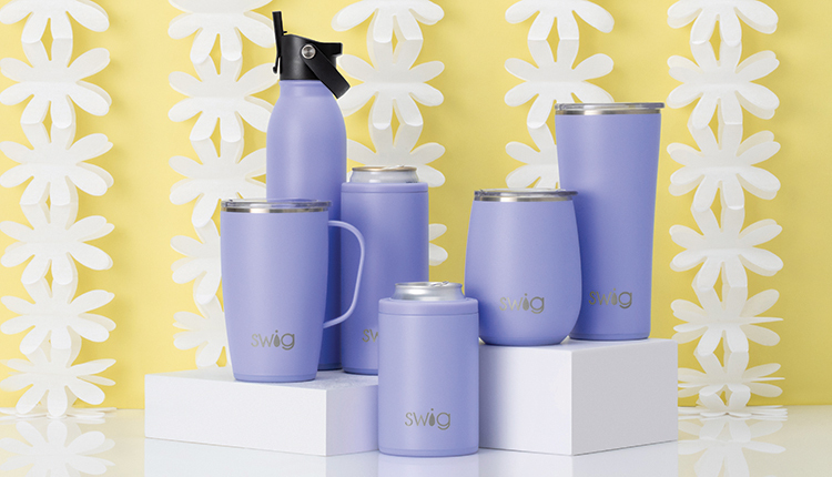
Drinkware company Swig Life was also ready for the Color of the Year announcement with periwinkle shades already in its lineup. Its products are designed for women and “every cup or bottle should be considered a fashion accessory much like handbags and shoes,” says Tracee Mathes, Swig Life CEO and founder. “This fashion-forward approach is what makes Swig Life no ordinary drinkware company and why our print and color choices follow fashion trends, like this year’s Very Peri Pantone Color of the Year, that align with our customer’s style and become an extension of her wardrobe and style.”
Purple hues like Hydrangea and Mermazing Summer collections continue to be top sellers, and this spring the company is launching a new floral print, Morning Glory, that reflects the influence of the Very Peri trend.
“As a company dedicated to creating product for women by women, we love the bold, courageous and imaginative qualities of Very Peri,” says Mathes.
Rekindling gratitude for some of the qualities that blue represents complemented by a new perspective that resonates today, Very Peri places the future ahead in a new light, according to Pantone. How will you incorporate the color of the year into your store’s future?