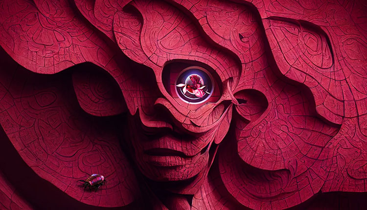
Pantone, a global color authority and provider of professional color language standards and digital solutions for the design community has announced its 2023 Pantone’s Color of the Year, Viva Magenta 18-1750. According to Pantone, the new color vibrates with vim and vigor. An unconventional shade for an unconventional time, Viva Magenta is a symbol of strength, inclusivity and self expression.
Pantone describes Viva Magenta as “a shade rooted in nature descending from the red family and expressive of a new signal of strength. Viva Magenta is brave and fearless, and a pulsating color whose exuberance promotes a joyous and optimistic celebration, writing a new narrative.”
This year’s Color of the Year is powerful and empowering. It is a new animated red that revels in pure joy, encouraging experimentation and self-expression without restraint, an electrifying, and a boundaryless shade that is manifesting as a stand-out statement. Pantone 18-1750 Viva Magenta welcomes anyone and everyone with the same verve for life and rebellious spirit. It is a color that is audacious, full of wit and inclusive of all.
Leatrice Eiseeman, executive director, Pantone Color Institute, says, “In this age of technology, we look to draw inspiration from nature and what is real. PANTONE 18-1750 Viva Magenta descends from the red family, and is inspired by the red of cochineal, one of the most precious dyes belonging to the natural dye family as well as one of the strongest and brightest the world has known.
She adds, “Rooted in the primordial, PANTONE 18-1750 Viva Magenta reconnects us to original matter. Invoking the forces of nature, PANTONE 18-1750 Viva Magenta galvanizes our spirit, helping us to build our inner strength.”
The new color will influence design; apparel and fashion accessories; beauty and hair; home decor and interior design; packaging and multimedia design.
The Color of the Year selection process requires thoughtful consideration and trend analysis. To arrive at the selection each year, Pantone’s color experts at the Pantone Color Institute comb the world looking for new color influences. This can include the entertainment industry and films in production, traveling art collections and new artists, fashion, all areas of design, popular travel destinations, as well as new lifestyles, playstyles, and socio-economic conditions. Influences may also stem from new technologies, materials, textures, and effects that impact color, relevant social media platforms and even up-coming sporting events that capture worldwide attention. For 23 years, Pantone’s Color of the Year has influenced product development and purchasing decisions in multiple industries, including fashion, home furnishings, and industrial design, as well as product packaging and graphic design. Past selections for Color of the Year include:
- Pantone 17-3938 Veri Peri (2021)
- Pantone 17-5104 Ultimate Gray and Pantone 13-0647 Illuminating (2021)
- Pantone 19-4052 Classic Blue (2020)
- Pantone 16-1546 Living Coral (2019)
- Pantone 18-3838 Ultra Violet (2018)
- Pantone 15-0343 Greenery (2017)
- Pantone 15-3919 Serenity and Pantone 13-1520 Rose Quartz (2016)
- Pantone 18-1438 Marsala (2015)
- Pantone 18-3224 Radiant Orchid (2014)
- Pantone 17-5641 Emerald (2013)
- Pantone 17-1463 Tangerine Tango (2012)
- Pantone 18-2120 Honeysuckle (2011)
- Pantone 15-5519 Turquoise (2010)
- Pantone 14-0848 Mimosa (2009)
- Pantone 18-3943 Blue Iris (2008)
- Pantone 19-1557 Chili Pepper (2007)
- Pantone 13-1106 Sand Dollar (2006)
- Pantone 15-5217 Blue Turquoise (2005)
- Pantone 17-1456 Tigerlily (2004)
- Pantone 14-4811 Aqua Sky (2003)
- Pantone 19-1664 True Red (2002)
- Pantone 17-2031 Fuchsia Rose (2001)
- Pantone 15-4020 Cerulean (2000)