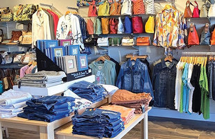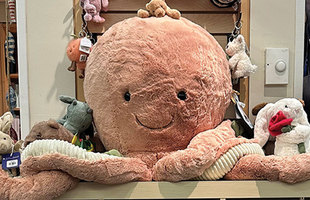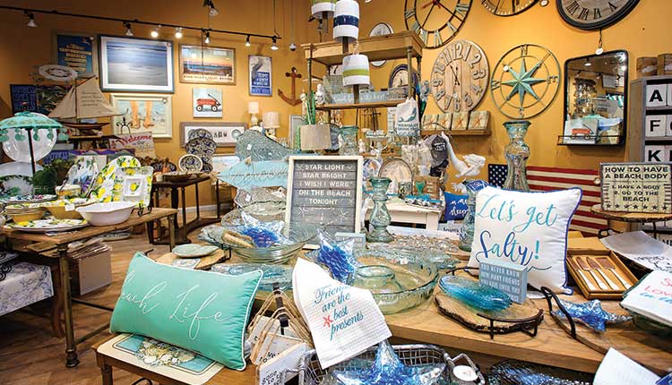
Carrying the right merchandise and having the right location are critical factors in running a successful seaside store. But just as important, if not paramount, is the way the store is configured. The layout of the store, from the positioning of the fixtures to the furnishings, entrances, aisles and checkouts, have a major impact on customer comfort, the amount of time shoppers spend in your store and even how much they buy.
“A store’s layout is the manner in which the retailer guides the customer through the store,” says Chicago-based visual merchandising consultant and educator Amy Meadows. “It is the means by which that store’s owner introduces, prioritizes and creates storytelling moments. It’s how the customer is made to feel welcomed, informed and engaged.”
Think of your layout as a kind of silent tour guide leading your shoppers to what you want them to see and hopefully purchase.
Storytelling and adjacency
You may already be familiar with the concept of creating stories with your merchandise. But Meadows suggests thinking of the store itself as a story. “Each section, each fixture is another chapter of that story.”
In a book, each chapter flows into the next, advancing the narrative — the surprise ending never comes in the middle. The way each merchandise category flows logically into the next in retailing is called adjacency.
Meadows explains, “A shopper shouldn’t have to walk all the way across the store to find the toys once they’ve been in the kids’ [clothing] section.”
Your store’s layout can encourage multiple sales, Meadows says. “Some of that can be accomplished by how you’re grouping items together,” she says. For instance, displaying a dress with a coordinating bag and jewelry.
The store’s name notwithstanding, there’s nothing willy-nilly about the layout of the Willy Nilly Trading Co. of Bayshore, New York. “Our layout is finely edited, with well-defined departments,” says Lynn Brey, co-owner. “Categories aren’t jumbled together. Baby stuff is kept with baby stuff and near the wedding department, not scattered around in different spots, though I might put a couple of nautical baby items in with nautical.”
Noticing customer traffic patterns through your store pays off, too. Lisa Haney, owner of the California Cottage in Seal Beach, California, observed that people tend to head toward the right when they come in, “so we’ve put our jewelry section right there. It’s the first thing they see when they walk in. Jewelry is an amazing seller for us, so we have it hanging on the walls, on tables and on half-a-dozen or so spinners.”
Making space count
Meadows teaches retailers to walk a mile in the shopper’s shoes. “It helps you detect the pain points that might cause someone to say, ‘not now — perhaps another time.’”
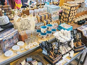
“We’re very lucky that we have so much space,” says Brey, speaking of Willy Nilly’s generous 6,000 square feet. “Especially during COVID. People don’t feel like they’re walking into a cramped area. Everything is on tables and neatly categorized; it’s easy shopping.”
Brey and her partner, Marilyn Schulman, pride themselves on giving their customers exciting displays “so they’ll really want to come in here — they’ll spend an hour, hour-and-a-half just milling around,” says Brey. “People buy many different products at a time. They’re not just coming in for one thing.”
Jason and Aleksandra Newcomb co-own three, soon to be four, Aleksandra’s Gift Shops in Savannah, Georgia. They try to make it easy for their customers for find what they’re looking for without making the stores feel claustrophobic. That can be a challenge.
“We have to use every single inch of space in our shops,” says Jason Newcomb. “Our first store is around 600 square feet, the big one is around 2,500 and the third is about 2,200. The big one has 15-foot ceilings, and we hang T-shirts on the walls three high.”
Explore every corner
No matter how large or small your store is, you want to encourage patrons to check out every square foot of it. “That relies heavily upon ‘strike points,’” says Meadows. A strike point is an area in the store — a grouping near the entrance or a special table in an aisle that is dedicated to showing an edited assortment of goods for the purpose of promoting a trend or new products.
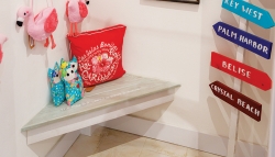
Every strike point should have a visually arresting display such as a mannequin platform, a color story or a table with a new product and some fresh flowers. “If customers go down a certain aisle, take a left and end up facing a wall, make sure that wall has something interesting on it,” advises Meadows.
In a small space, it is hard for customers to see clearly all the way to the back wall, according to Meadows “so you’ll have to stagger the height and position of displays as you work toward the perimeter walls.”
One strategy she recommends is creating a story that shows a wide selection of goods from all over the store.
Store owners often tell Meadows, “I need my full-priced, highest-profit-margin items right up front.” But you don’t want your shoppers to stop there. You can configure your layout so steer them toward other parts of the store, she advises.
Brey’s strategy is to place the register at the furthest point in the rear. “It forces customers to actually walk through the store and not just come in for a piece of jewelry and head right to the counter. There’s just one main register and they have to go through all the different departments to get to it.”
Sales and clearance strategy
Many store owners will put sales or clearance items at the front of the store. This is a mistake, according to Meadows. Use them as another lure to draw shoppers deeper into the depths of your space.
Jason Newcomb does this at Aleksandra’s. “People like to hunt for bargains so we usually put our sales and clearance racks in the back. The best and the prettiest items, the stuff that you know is going to sell really well, we have those front and center.”
Keep things moving
Meadows says you must be prepared to change, refresh and update constantly, “or your layout just becomes landscape.”
Haney knows this. “I’m really hands-on with the layout,” she says. “About once a month I move things around just for the fun of it, just to keep it fresh and fun for our regulars, instead of having them walk in and see the same-old, same-old.”
“We’re always moving things around,” says Brey. “And constantly looking at our sales reports. If we haven’t seen any movement in an item, something’s not right. So we’ll move it and it’ll start selling, and then we’ll know that the issue was one of placement.”
Staying on top of what’s selling — or isn’t — is a constant process. “Just when you think something’s working, you’ll start seeing sales go down,” Jason Newcomb says. “Or you can put something up front and it won’t do well, but move it 5 feet away and it takes off.”
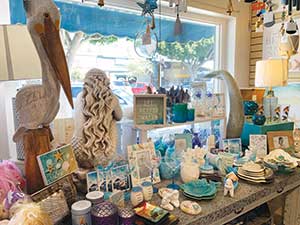
The Newcombs discovered that you can’t fall in love with any particular layout or fixture. In their newest store, women’s fashions were located at the entrance and souvenirs were in the back in beautiful built-in glass cases. But people would peek in the cases and keep walking, says Jason Newcomb, “so we moved the fashions to the back, closer to the dressing rooms and put the souvenirs up front and out of the cases and they both took off.”
Haney says certain things can be moved around without making any difference in sales. “But then there are other things, like our candles — we have to keep them up front where people can smell the one we have lit. When they’re tucked in the back then they don’t smell them and they don’t buy.”
The same thing happened with her tea towels. “I put them in the back of the store and sales dropped tremendously. Now they’re in the front and selling very well.”
Your layout isn’t just a collection of fixtures and furnishings. Think of it as the silent sales associate that gently guides your customers to all the wonderful goodies your seaside store has to offer — treasures they just have to bring home with them.
