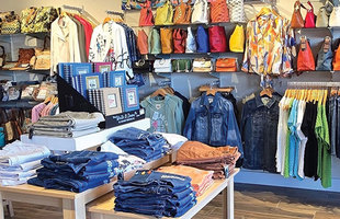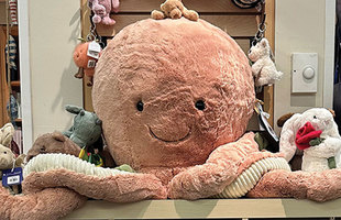
Your seaside store is filled with carefully curated clothing, gifts, personal care items and decorative home goods. The merchandise is probably nice enough to sell itself. But as you already know, even the best items need a little push. That’s where the art of display comes in. A good visual presentation can make your already appealing merchandise darned near irresistible.
Amanda Frick has 20 years of experience as a visual merchandiser for large chain stores and still works as a brand representative. She and her husband own The Neighborhood Shop with two locations in Florida: Stuart and Ormond Beach.
When asked how important effective displays are in a retail store, Frick is blunt. “It’s make it or break it.”
That doesn’t necessarily mean you should run out and buy a whole bunch of expensive hardware.
“I’ve worked with so many fixtures over the years that people have spent thousands of dollars for,” she says. “But at the end of the day the customer is buying the product, not the fixture. As long as everything looks consistent and cohesive whatever you use is fine.”
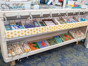
Like discarded literature. For their stores, Frick and her husband “rescued” over 700 books, removed the dust jackets for a rustic look, then stacked them and used them as shelving. And when they wanted to achieve a “raw wood” look for one of their locations, they repurposed wooden shipping pallets they got for free, cleaned them up and reassembled them into paneling and shelving.
Another creative display was inspired by something Frick inherited. “I had a lot of cool old vintage luggage that came from my grandmother. We use them in our windows and as table risers, and they evoke a nostalgic wanderlust feel.”
Repurposing furniture
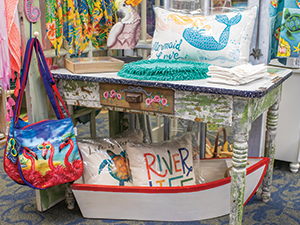
A wide variety of commercial displays are available: circular clothing racks, end caps, standalone displays, dump bins and gondolas. As long as they fit the overall theme of your store, these can work well. When they don’t, it’s time to get creative.
“We’ve built our whole color scheme around a green hutch, the first piece of furniture we purchased when we started the store in 2005,” says Heather Cole, who co-owns the 4,000-square-foot, two-stores-in-one complex with husband Carper and friend Tracy Summer.
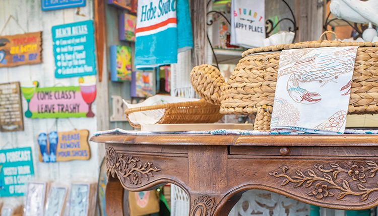
Ann Nyhuis did just that. The owner of Sandy Bar Cove, Stuart, Florida, uses repurposed and refinished old tables, baker’s racks, antique wicker and Hoosier cabinets as fixtures. Homey pieces like these convey the proper atmosphere for her store’s theme, “Sandy the Mermaid’s House,” better than any commercial display fixtures could.
Sandy is the store’s mascot. The mermaid mannequin sits in the store’s front window and is herself a display as when Nyhuis drapes jewelry over her hand.
Repurposed furniture also fits the old-timey feel of Pawley’s Island Mercantile, Home of the Candy Cottage, Pawley’s Island, South Carolina.
“It’s typically done up seasonally, like for Valentine Day’s or Easter. When people walk in, boom — they see it, and it’s festive and fun.”
Color stories
To get the maximum impact out of a display, Frick has one word: color. “People shop by color,” she says. “It’s good to learn color theory because color is the thing that gets people’s attention. It’s your number-one weapon.”
And the best way to weaponize color, according to Frick, is to create “color stories.” That’s done by grouping merchandise together — even different types of merchandise, like glassware and purses — as long as their hues harmonize well together.
Examples of color stories she’s created include: “On one table I’m using plum with eggshell blue. On the guy’s side of our store, I use a lot of navy and red, because guys love Americana colors. Those colors, mixed with gray make a really pretty color story.”
Frick tries to stick with two colors at a time versus five or six colors “because it just gets too confusing.”
Nyhuis created a color story for Sandy Bar Cove’s New Year’s window.
“Everything was coral colors, a palette of golds and teals and blues. There was a coral necklace, a coral bowl and hearts and starfish with sea glass in those colors.”
Cole knows to break up monotony and build a colorway, theme or story.
“We’ll put a really bright color front and center. Maybe they won’t buy the item in bright yellow, but that’s what's going to catch their eye — and then they’ll see the rest of the merchandise.”
Best-dressed windows
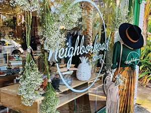
Good window displays are critical. They entice people to cross the threshold and see what else you have to offer.
Nyhuis, whose store is in an historic building, has five large ceiling-to-floor windows to play with. In each one, she sets up thematic mobile vignettes highlighting the season, certain items or a local artisan.
One window houses a custom-made miniature mockup of the town of Stuart. It’s a conversation piece that causes people to stop, look — and then come in.
Charisma Home and Gifts in Coronado, California, uses their stores’ front window to promote new or seasonal items and “to draw people in,” says Shannon Weigel, who owns the store with daughter Tori Geddes. “We always have child mannequins in the window to let people know that we have kid’s clothing.”
Also adorning the window are attention- getting inspirational signs that are also for sale. “2021 is Your Year to Shine — XOXO Spread Kindness” is what passersby saw in early 2021. Before that it was “We Survived the 2020 S--t Show.”
Point of entry
What people see — or don’t see — when they first walk into your store deserves careful thought. Frick says an entry point should never have a six-foot-tall display rack blocking a customer’s view of the rest of your store.
“We’ll never have something super tall right in the front,” agrees Cole. “We like people to get a good feel for everything we have, not coming in and saying, ‘Oh, they only have clothing,’ and turning around and leaving.”
In early 2021, customers entering the mercantile part of the store, were greeted by candles, perfumes and different soaps.
In Frick’s stores, nesting tables take center stage. The first thing people see when they walk in is a table about the same height as a dining room table. She’ll put another smaller table on top of that and build a display. Under the main table, she’ll place another nesting table with merchandise on it.
“They’re short, so you can still see the racks behind them,’ Frick describes. “It’s a way to tell a really good seasonal color story right when somebody walks in.”
Height matters
Frick might have made a good pharaoh. “I’m constantly telling my staff — ‘Build pyramids everywhere!’ They’re good displays — your eyes travel more, and you see everything.”
Here’s how she does it. When she’s building a display on a table, she’ll have something tall, say a big backpack. Next to it, she’ll place a stack of hoodies that are half as tall, and then add a couple of candles that are shorter than the hoodies.
“I always have different heights next to each other, and I never place things that are the same shape next to each other either,” she says.
Height matters particularly with shelving. According to Nyhuis, eye-level goods sell best.
“The shelves that are around 5-foot, 6-inches, or 5-foot-7-inches, are the most valuable real estate in our store. It’s a comfortable height for people to reach out and pick things up.”
Eye level is indeed buy level, as Cole discovered thanks to some puppy and kitten plush. At first, they were up too high for her young customers to see them.
“Then we moved them into apple baskets on teacup hooks with their little heads sticking out and hung them lower. Now as soon as the kids come in they run right to them.”
Sales of the stuffed animals increased 70% with the new arrangement.
Even lower than the lowest shelf is the floor. Some retailers use it as a selling space, but Frick chooses not to. She says the merchandise would get dirty or people might perceive items displayed there as less valuable.
And, according to Frick, too high is also a no-no. People don’t want to stretch to grab something that’s too far out of their reach.
“You don’t want to have any rack taller than 5 feet anyway,” says Frick. “You can’t see over it, and it’s a security issue; someone could hide back there and steal half your store.”
Mix it up
Frick says that your store’s walls should be interesting, with different heights, hardware and arrangements of merchandise.
Slatwall, a type of paneling that allows hooks and hanging racks to be inserted anywhere, is not one of Frick’s favorites.
“I’ve looked at a lot of stores that use slatwall, and typically a whole wall will be faced out all the way down, and all you can see is one dimension. That’s boring.”
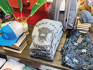
Instead, Frick says every 4 feet on a wall needs to look different than the next 4 feet. "So in one 4-foot stretch, I’ll have face-outs with hardware sticking straight out and a couple of shelves, and at the bottom I’ll do a side hang. And in the next 4 feet, I’ll do a couple of shelves and a face-out. That keeps the shopper’s eye moving and interested in what you have.”
Think outside the (accompanying) box
Many brands of merchandise come with dedicated displays. That doesn’t mean you have to use them. “Sometimes they don’t fit with the style and look of the store,” says Cole.
This was the case with a brand of men’s shoes. When they didn’t move well, Cole decided it was time to think outside the shoe box and put them on hang cards.
“Now they sell so much better,” she says. “We were initially concerned that not being in boxes was going to cheapen the product. But this way, customers can easily access them and find their sizes.”
Pawley’s Island Mercantile sells at least 50% more of them just because people don’t have to ask for help. “The more self-sufficient you can make things, the better,” Frick adds.
Lighting and signage
Of course, the most creative display in the world won’t be effective if the customer needs a flashlight to see it. “Good lighting is super important,” says Frick.
Cole and her partners recently hired electricians to brighten up some dark areas and aim spotlights on others. When they weren’t able to install lights in one particularly shadowy area, the problem was solved by adding a string of Edison bulbs.
“They’re whimsical and add a lot of charm,” she says. “When they’re off it’s really dark. I remember thinking, ‘How did we go 10 years without these?’”
Nyhuis says signage too is extremely important. Believing that “less is more when you’re trying to convey a message,” she keeps her sale and other signs no bigger than a post-it note or a three-by-five card. “To make it stand out and draw the eye, I’ll mount it against a contrasting color so it pops. Otherwise it can just get lost.”
Cole uses signs to highlight items created by local artisans and “Made in the USA.”
Frick likes to use little chalkboard signs that she can erase and reuse, as she does with her jewelry collections from around the world — for example: “Fair Traded, Made by Artisans in Haiti.” “It’s a way to have conversations with customers without interrupting them,” she says.
Writing inspirational sayings on them is another idea.
“For a while, I had one that said ‘Put Your Positivity Pants On.’ They make people feel happy while they’re in the store,” says Frick.
It’s the experience
You may have heard the old adage, “Don’t sell the steak, sell the sizzle.”
In an era where a lot of what our boutiques are selling can be bought online, Frick says it’s important to remember that we’re not selling a product, we’re selling an experience.
“If people come into your store and it looks like the islands, smells like coconut and Bob Marley is playing in the background they instantly relax. Maybe they buy that coconut-shaped cup and whenever they use it they remember going into your store and how good it made them feel.”
An eye-catching display that tells a story is the sizzle that can entice someone to pull that wallet out and buy. Have fun creating your own sizzlers!
