In Nantucket, you have to be on your game when it comes to storefront design. The tiny island off the coast of Massachusetts bustles with high-end stores, restaurants and other offerings that cater to the tourists who flock there. In short, choices abound.
Susan Fairgrieve is most definitely on her game. Her boutique, ACK 4170, has won numerous awards. It was named Best Nantucket Gift Shop by readers of Cape Cod Magazine in 2019.
Her exceptional storefront designs have been lauded too. They’ve won several awards from the local chamber of commerce.
“Since I opened, I’ve won every People’s Choice award for window and storefront displays,” she said. “They were for Daffodil Weekend, Fourth of July and Christmas Stroll.”
Her advice? “People’s attention spans are only a few seconds long, so your design has to be eye-catching and appealing.”
Distinguishing your retail store is critically important these days, since brick-and-mortar stores are facing more competition from the ever-growing online shopping options, which are easy and speedy.
Why troop to a store, where you have to fight traffic and struggle for parking, when you can shop from home with a few clicks?
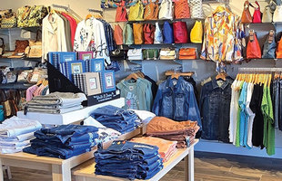
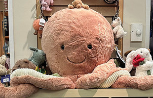
Well, if you do that, you miss out on shopping adventures such as a visit to ACK 4170. It offers Nantucket-inspired accessories, apparel, jewelry, home decor, stationery and art, much of it created by local artisans.
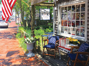
Fairgrieve does all of the interior and exterior designing for her shop, which is named after the airport code for Nantucket — ACK — and the island’s latitude and longitude — 41 degrees north, 70 degrees west. The name is even trademarked. Yes, she is creative.
You can see that creativity in her storefront, and she puts considerable thought and effort into how to make it stand out. She’s a big believer in having her store reflect Nantucket’s look and feel. Her designs are more nautical than beachy, she said, so you’ll see rope, fishnet and lobster traps.
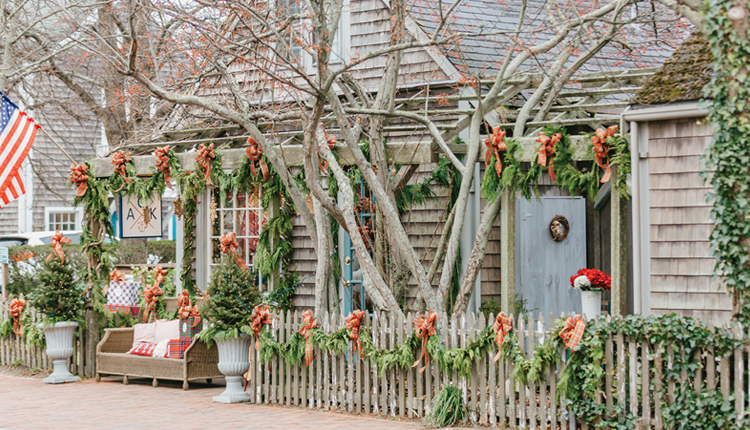
She changes this up for holidays or special island events. This past Christmas, her storefront featured 300 feet of cedar pine roping, 1,400 tiny white lights and 40 plaid bows.
When speaking of her design philosophy, she says less is more.
“It’s a stronger look,” Fairgrieve said. “That way people can focus on just a couple of items.”
So you won’t see a lot of merchandise crammed into her front window.
Be different
Other stores look to create magic too. Manifest Design in Myrtle Beach, S.C., contains some pretty interesting elements, to say the least. You can see a restored 1965 Shelby Cobra sports car, a 3-foot-high model of a Douglas DC-3 airliner and a carousel horse displayed among the nautical gifts and decor items that the store specializes in.
When the shop’s doors are open, all of this is easily visible to passersby.
Connie Lincoln, owner of the store, said it offers interior design services and products for homes and offices. It also has a niche specialty: interior design for yachts.
“From nautical themes to seaworthy decor, we put your ship in great shape,” Manifest Design’s website notes. So what’s a Cobra sports car have to do with that specialty? Um, nothing really.
“We try to be a bit different,” Lincoln said, “a little whimsical.”
One of the challenges facing retail stores is how to entice customers to venture inside, given that people are getting increasingly turned off by stale, drab, uninspiring outlets.
Look at malls. Well, look at one if you can actually find one. The surviving malls have been transformed to offer everything from fitness centers to high-end cinema houses where fine wine and dining are offered. Customers today want an experience, not a Sears. (Um, sorry Sears . . .)
It takes creative thinking to be successful, said Bob Phibbs, president and CEO of a consulting firm called The Retail Doctor.
“Stores that were cut in the 1950s and ’60s still jamming their stores with merchandise and offering two-for-one prices are not going to make it,” he said. “That’s a punishing place to be.”
But for coastal stores, this is an exciting time, Phibbs said. Tourism is up around the world, meaning customers are there to be had. But it takes originality and creativity to capture them.
One technique he suggests is creating a window display that tells a story. For instance, he noticed that one summer a Pottery Barn showcased all the makings for a margarita — blender, glasses, mixers, salt — in one of its windows.
“Make it easy to understand,” he said.
You don’t want to overload people with a whole bunch of merchandise.
Everything Except Water stores, which sell designer swimsuits, are masters at minimalizing their storefront displays.
Maybe just a few swimsuits are shown, but the look is so clean and well lighted that it borders on artistic.
Today’s customers are busy and easily distracted, Phibbs said. Notice how many people are looking down at their phones while walking past your store, for instance. You need a display that can grab their attention. And you need to change it up every few weeks to keep it fresh.
How important are storefronts? Here’s one clue. A number of cities offer store owners financial help to redesign them. The city of San Diego is one of many that has a Storefront Improvement Program, in which store owners can get both money and design help.
In fiscal year 2017, the city provided $246,974, while store owners invested $747,825. It’s considered a win-win. The stores get improved facades that attract customers. The city gets more dynamic neighborhoods, which attract other businesses and residents.
Large retailers and chains put a lot of expertise into their outward appearance. They hire top architects and artistic directors who understand the psychology behind design.
“The perfect window display will use a single color theme and avoid clutter. Too many products creates an impression of low value, while few products with plenty of space promotes luxury,” according to an article called “The Psychology of Retail Store Design,” which appears on the Storebest website (www.storebest.ie).
Other experts note that we connect with faces, so storefront displays should include pictures of faces . . . attractive ones, of course.
A labor of love
But some people design a little bit differently. That includes Genie Jessup, manager of the Juno Shoe Girl boutique in Jupiter, Fla. She has no formal training in window design, she freely admits.
“We do it with love,” she said.
Jessup is big on showcasing the newest items, and she will change the look weekly, she said. She’s also quick to feature the work of the store’s owner, Nina Gelardi, who designs shoes. Her shoes are designed so you can switch out ornaments and give them a new look whenever you please.
Juno Shoe Girl has a second location in Hobe Sound, Fla., but overall it’s a mom-and-pop operation, Jessup said. That means she wears many hats, including that of display designer.
Jessup enjoys it, she said, because she gets the chance to take chances. She normally displays three dresses outside, which gives the storefront color and vibrancy. She has a weather app, so if rain comes, she can move them inside at a moment’s notice.
For holidays, she adds festive touches.
“But I don’t overdo it,” she said.
She places emphasis on creating a storefront that people find pleasing and welcoming. She makes sure that the colors coordinate and the clothing looks fresh and appealing.
She didn’t say anything about the psychology behind her work, other than: “We’re trying to show how much we love what we’re selling.” ■
FLOWER POWER
You know who can help with storefront design? Mother Nature.
One of the most striking — and studies show, pleasing — features of a storefront design is greenery.
Think about it. Many stores face streets and sidewalks, which can be lacking when it comes to natural elements. We’re talking about a lot of concrete, asphalt, parking meters and signal lights.
So adding planters, flower beds and window boxes can go a long way toward creating a more appealing look and holistic vibe, retail experts say.
Susan Fairgrieve, the owner of ACK 4170 in Nantucket, keeps a vase of fresh flowers and lounge chairs outside her store.
“It’s a pleasing addition,” she said.
A blog item from Ambius, a firm that enhances commercial design with living plants, notes: “Retail environments can harness nature’s inherent powers to put people at ease by decorating their space with lush greenery.”
Native Land Design, a landscaping firm in Cedar Park, Texas, suggests placing plants in host of places — at entrances, around signs and in outdoor planters around the property. It recommends using native plants so maintenance is kept to a minimum.
There is science behind this. Plants not only help sooth your customers; they do the same for your employees.
“What do trees, shrubs, grasses, green plants, parks, beaches, open fields and flowering gardens have to do with your mental health?” asks a recent Psychology Today article. “Just about everything, according to an extensive review of the scientific literature supporting the benefits of exposure to natural settings."
Specifically, the researchers found that "people who surround themselves with plant life and other forms of natural beauty, indoors and out, experience emotional and mental health benefits that have a positive impact on their social, psychological, physical, cognitive, environmental and spiritual well-being.”
So go green. And you might see more of the other green in your cash register.
