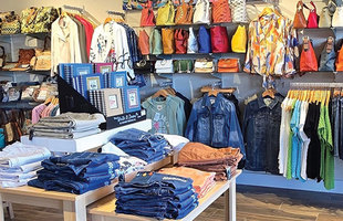
Signs serve so many purposes. They warn, direct and alert. Like a beacon of light, they help us know if we’re on the wrong track — or the right one. For brick-and-mortar retailers, having well-designed, eye-catching signs inside and outside their stores is nothing short of essential.
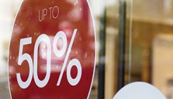
2. If the sign is inside the store, is it supposed to direct customers to a product display? Will it motivate them to buy?
3. Is the sign to convey information, such as a sale that’s going on today?
4. Is the sign consistent with my branding?
5. Does the sign enhance the overall image of my business?
In major beach and coastal towns with store after store selling similar items, signage plays an important role in directing people to your door and keeping customers looking around once inside. And yet, despite how important signs are, many retailers create signs without giving them much thought. They’re missing a big opportunity.
An attention-getting storefront sign makes it easy for your customer to find you, and provides a preview to entice someone inside your establishment. Once inside, the signs your customers see should tell them about your offerings without making them work too hard. In a noisy world full of competing messages, your signs should be carefully crafted to stand out from the background static.
Signs should be attractive and understandable with a clear message, because even the best-organized retail store is a distraction-filled environment. Confused, distracted customers will not spend their money with you. Excellent signage cuts through the clutter and reduces their fears and frustrations.
Good signs are your silent sellers. Think of them as your most affordable and highest grossing employee. They communicate with your customers, telling them what you want them to know about your merchandise. Great signs will stop people in their tracks and make them take action.
Think of all the places in your store where you could post informational messages: on the floor, via a printed decal or mat; inside dressing rooms and restrooms (if you have them); and at the exit, saying thank you and come again.
Away from the store, bus benches, car wraps, and magnetic signs on your personal vehicles are just some possibilities.

Often retailers put out signs quickly without much effort or thought because they “just need to get something out there,” but the fact is they are missing the key purpose of signage and a big opportunity.
You may be saying, “But I’m artistically challenged — how can I create arresting signs?” That’s what graphic designers are for. Free and low-cost online sites such as Canva and Picmonkey can also help.
Before you create a sign, identify a clear purpose, plan carefully what it needs to say and allow adequate time to develop it. Your brand and your customers deserve your best efforts. And the rewards will be worth it.
Sara Burks has been in the boutique industry for over 20 years and has an MBA. As The Boutique Hub’s director of education and partnerships, she shares practical knowledge of the boutique business. She can be reached at sara@theboutiquehub.com.
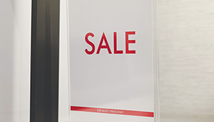
8 words and phrases that encourage action
- You. It’s the most powerful word a sign can have, making customers feel they’re being spoken to directly.
- Free, save, giveaway, bonus, BOGO (buy one, get one free). Who isn’t excited by the words “free” or “save”?
- Easy care, machine washable, comfortable. These words tap into people’s desire for simplicity and convenience.
- Trusted, #1 selling, staff favorite, best buy. Words like these provide validation that a customer is making the right choice.
- Limited, immediately, today, hurry, exclusive. These words create a sense of urgency or FOMO, the fear of missing out.
- New. Everyone likes novelty.
- Secret. Billions of Big Macs have been sold based on their “secret sauce.” Everyone wants to be in on a deal no one else is getting.
- Fast, same-day service. Time is money for everyone today, not just business owners.
