The signs and displays people see outside your seaside store do much more than simply tell people the name of your business. The style, the colors, even the fonts on your signage speak forth a great deal of information, such as the type of shop it is and the atmosphere one will find within its walls. The message shoppers get from what they see on the outside of your shop helps determine whether they ever set foot inside.
But first, you have to get their attention. “Effective outdoor signage allows you to stand out from your competitors on a busy street,” says consultant Catherine Donovan Wagner, CEO of Retail Mavens, a Chicago-area consulting firm. “There are so many of your competitors up and down that same street vying for the attention of people driving or walking by. Your sign needs to stand out.”
Brittany Russo, owner of Kiya Marie by the Sea, Sandwich, Massachusetts, can vouch for that statement. “If you don’t have anything outside, people aren’t going to know what your shop is about,” she says. “A lot of people tell me that they saw my sign and thought it was really pretty — and that’s what made them decide to come in. If I didn’t have that, people would just drive right by because I’m on a really busy road.”
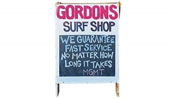
Craig Gordon, owner of Gordon’s Surf Shop, Point Pleasant Beach, New Jersey, can attest to that. “Even the best signage, when you’re driving past a building in the downtown, you’re really not seeing it until you pass it on foot,” he says.
Lisa Moore and her daughter Megan discovered the importance of signage in 2019 when they purchased a nautical-themed store called Blue Heron in Havre de Grace, Maryland (now called Blue Heron Gifts and Boutique). “The old sign didn’t mesh with our aesthetic,” says Lisa Moore. “It didn’t reflect the classy vibe we want people to feel when they come into our store” — one that features quality boutique brands such as Mud Pie, ShipShapeStyles sand Galleyware.
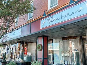
The old sign just said “Blue Heron,” giving no hint as to what type of business it was — a restaurant? A hair salon? “The previous owner, an artist, painted that sign,” recalls Lisa Moore. “It was just a blue heron with a sunset in the background. People walking and especially driving by couldn’t tell what we were or what we specialized in.”
Fortunately, Megan Moore has an eye for design, and created a new sign that suits the tone of the business much better. And, even more critically, the words “Gifts and Boutique” were added, removing any mystery.
Has the redesigned sign been helpful in attracting traffic to the store? “Oh, yes,” says Lisa Moore. “When people see our fresh, classy-looking sign, they’re intrigued and want to come in and see what type of merchandise we have.”
Words count
Words have the power to motivate as well as confuse. The verbiage on your signs should be chosen for maximum impact and clarity.
Words such as BOGO and sale jump immediately to mind. But don’t overlook words and phrases that are more subtly motivating. “Emotional words are more effective than people think they are,” says Wagner. “For instance, one of my clients doesn’t just say she has gifts — she says, ‘we have gifts that are intriguing and innovative.’ That makes them stand out from the competition.”
Wagner has another real-world example of this, from her experience as part owner of a children’s toy and clothing store. Sales took off when they put signs in the window saying they sold not just toys, but “memory-making toys.” “Those emotion-evoking words are really appealing to moms,” she says.
Gordon agrees that sign verbiage affects how a store is perceived. Although his main customers are surfers, he isn’t worried about appealing to them. “The surfers already know I’m here,” he says. “My signage and presentation in the front of the store is really geared toward drawing in the people who don’t surf.”
Unlike Blue Heron, in Gordon’s Surf Shop’s case removing two words from the main sign made all the difference.
“I used to have the words ‘surf shop’ as part of the logo,” he recalls. “People would see those words and keep walking.”
Since removing them, his traffic has increased. “Some people will still go, ‘Oh, it’s a surf shop,’ and walk back out — but every now and then, one of them will buy a souvenir,” he says. “Just changing that one little thing on my sign opened me up to more customers. If they don’t come through the door, you’re not going to sell anything to them.”
Words and phrases that describe what makes your store unique probably belong on your signs, especially your main one.
At Kiya Marie by the Sea, Russo uses “handcrafted”’ and “we have handcrafted gifts.” “It tells people that they won’t see the same stuff in my store that they’d see at some other generic shop,” says Russo. “It entices people to come in and see it.”
She also plays up the locally made aspect. “I’ll put an A-frame board out that says ‘Locally Handcrafted Gifts,’ just to catch a little bit more attention.”
Sometimes the most obvious messages are the most effective. Lisa Moore has found one phrase particularly impactful for her signs, “We Are Open.”
Many of the stores in Havre de Grace are closed Mondays and Tuesdays. “But we’re open seven days a week. When people the sign, it sends them our way,” she says.
Color choice
The color scheme of outdoor displays and signs should reflect the tone of your business. You personally may prefer muted colors or pastels, but brighter hues are more attention-getting, especially on a street crowded with other shops. But keep your colors consistent with your messaging.
“Loud, gaudy colors totally work for a T-shirt shop,” says Wagner. “If you’re a store selling women’s clothing and gifts, that would not be a good look.”
Russo says that the bright teal and purple hues of her nautical-themed sign attracts customers of all ages into Kiya Marie by the Sea. The colors clue shoppers in to what her business is all about. “These colors are very nautical and ocean-related and really eye-catching because they’re bright colors,” she says. “A lot of the stuff I have inside is very bright and airy and beachy.”
Neon or lit-up signs have their place, says Wagner. “You have to ask if it fits with your type of store, with your messaging.”
Fonts factors
When it comes to fonts, bigger is better. “The serif fonts are fancy, but they can be harder to read,” according to Wagner. She usually recommends using sans serif fonts because they’re easier to see.
In terms of font size, Wagner says to factor in the store’s demographic.
“Take the average age of your customers and double that number — that should be the smallest size font you ever use.” So if your average customer is age 40, the lettering on your signs should be at least 80-point.”
Russo says she strives for readability in her signs but admits, “I’m a sucker for those nice handwritten-style cursive fonts. My sign is still very readable, but has that whimsical look to it.”
Winsome windows
Most storefronts come with one or more windows, and retailers should use them to their full advantage. “We have four huge windows that we showcase our items in and we rotate the merchandise depending on the season,” says Lisa Moore.
Something else you’ll find on one of Blue Heron’s windows are the store’s Instagram and Facebook addresses and a QR code that, when scanned, takes a shopper directly to the store’s website.
“So if somebody wanted to look at our website or go straight to our Facebook page, they would just have to scan the QR code,” explains Lisa Moore.
Window displays are the place to run free and use bold colors, Wagner says. “A message along the bottom of the window in brightly colored lettering saying ‘We make you look like a gift hero’ can be very powerful.”
But Wagner cautions against putting too many items on view. “That’s a mistake that many store owners make — including me,” she admits. “You feel like you have to put all your best stuff out there, but if there’s too much, people will walk on by because they don’t have a spot on which to focus.”
Curb enthusiasm
Wagner used to be part owner of a children’s toy and clothing store. She says to get parents out of their cars and into the store, they had to get the kids’ attention first.
An “air dancer” — one of those wacky, waving inflatable people that you see in front of car dealerships — did the trick.
“To be completely honest, I didn’t really think that would work,” Wagner admits, “but it did — like a charm. The kids would see it and want to stop, and of course their moms came in with them. This display turned out to be really powerful.”
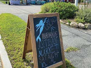
A-frame chalkboard signs work well for grabbing the attention of people walking by. They’re relatively inexpensive and have the advantage of being right in a pedestrian’s sightline. People walking straight ahead may not glance at your window or read above the door, but they will notice an A-frame in their path.
What about those racks of marked-down clothing that many seaside store owners will put in front of their stores? Do these really get people to stop and shop? “Absolutely,” Wagner says. “I’ve seen them used very well, very effectively. However, the problem with sale racks is that they have all these different items in various sizes,” says Wagner. “That doesn’t tell much of a story.”
Wagner suggests buying intentionally just for the outdoor rack. “That’s a very powerful technique,” explains Wagner. “For instance, for summer, find a sundress you love, preferably a kind that comes in just one size, and buy it deep in lots of colors.”
One Wagner’s clients sells a linen dress made in Italy. They are available in eight colors, and she buys them for $45 apiece and marks them up to $145.
“Then she can easily say, ‘It’s usually $145, but now it’s reduced to $99.’” A rack filled with just this one dress in different colors looks very appealing,” says Wagner.
Take a fresh look
You may be so used to your signs that you no longer really see them. “Often, people don’t really look at the front of their stores, and the signs get older-looking than they realize,” says Wagner. Now and then, take a look at your signs with a critical eye.
Handwritten signs aren’t necessarily bad, as long as they’re neat, readable and have some sort of style to them. But Wagner warns against posting unsightly hand-scrawled signs with unfriendly messages like ‘No shirt, no shoes, no service.’
Wagner says overall, “You need to be super clear about who your ideal customers are and do something that’s going to attract them. You’ve really got to set aside time to plan these things out, because if you try to do it ‘on the fly,’ you’ll get fly-sized results.”
Carefully crafted signs and displays can be the catalyst that propels a shopper through the doors of your seaside store. With a little creativity, thought and planning, those signs should attract ideal customers who want to purchase your goods.