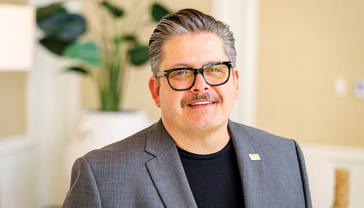
Michael Hale of Retail Rehab offers several visual merchandising ideas for seaside retailers to try.One of the main goals of visual merchandising is to elevate the perceived value of products in a store. For example, a customer would be willing to pay more for a shirt that is neatly folded and displayed than a shirt that is disheveled and out of place in the store. Customers care about product presentation.
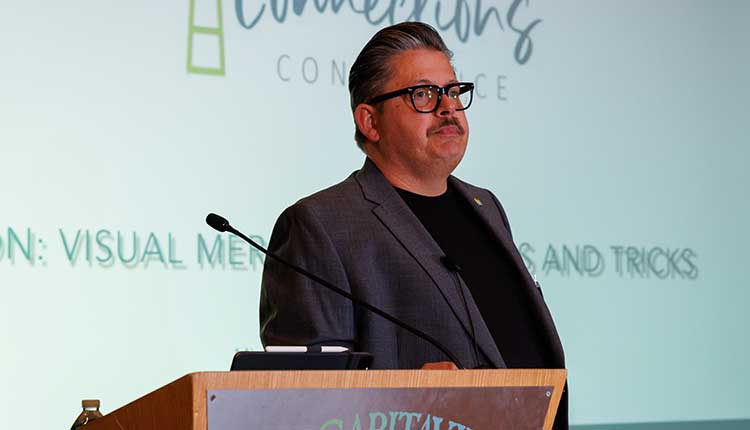
Michael Hale, owner of Los Angeles-based retail consulting firm Retail Rehab, shared his best practices for visual merchandising during the 2023 Coastal Connections Conference, which took place Oct. 22-24 at the Margaritaville Resort Orlando. He presented the final day of the event in a session titled, “Visual Merchandising Tips & Tricks.”
“It’s really important to make sure that we bring the value of our product up to what our pricing is,” said Hale, who has more than 30 years of experience in various retail capacities.
Hale offered answers to some common questions on visual merchandising in his presentation. The following is a Q&A based on that session.
Seaside Retailer (SR): What should seaside retailers keep in mind when it comes to adjacencies in their stores?
Michael Hale (MH): When a client will reach out to me and ask me to help them with laying out their store, I want to know what your products are and what you want your product sales to look like. What are your objectives with your product presentation? What do you want to sell more of? … I really work with them on their adjacencies. Part of the idea of setting up your adjacencies best is that somebody comes in and they’re buying a kid’s T-shirt, if there’s a plush right there, they may pick up a second item. It helps with add-on sales. If there’s apparel there and they see a hat or a pair of shoes or a necklace, it helps with impulse sales and add-on sales.
SR: How can retailers make stacked products look better?
MH: If you’re a store that carries shot glasses or mugs or snow globes or anything like that, I’ve worked with a lot of clients where we have looked at how we elevate the perceived value of even a $4.99 shot glass. By taking and using little sheets of [plexiglass] — you do a layer here. We have a layer of [plexiglass] between the two layers of shot glasses. By doing that, it means that I’m saying that $4.99 shot glass has value [and] that I put attention to it instead of stacking them inside of each other where I’m showing that they don’t really have so much value.
By using stacking sheets and less shelves, I’ve been able to fit more product into less space because I haven’t had to use so much space for hardware shelving.
SR: Do you suggest theming products together in displays or sections?
MH: Theming of collections is if I have a Florida shot glass, a Florida mug, a Florida tote bag and a Florida T-shirt and they all come from separate vendors, I might pull all those together to create a theme of that one collection.
This works good if you’ve got [products] that are sports related. You might put all of that sports team together instead of having all your caps together. For all different sports, you collect the [different] sports teams together.
SR: What tips would you offer seaside retailers when it comes to regional food merchandising?
MH: With regional food merchandising, I always like to say this is a place where you can have some fun with products and display elements. A lot of times there are small chocolate bars or candies or taffies or something and you need containers for them. A fan favorite of mine is The Container Store. I will go there anytime I’m setting up a store. But I also challenge my clients to take a look at their vendor list and see what props you can buy from a vendor and put a price tag on them.
“Is there a wall that when you walk in everybody,
whatever I put on that wall is a good seller? Those are great spaces for good opportunities.” — Michael Hale
Say you’re not a home goods store but you have a vendor that supplies trays. You might really sell regional foods, but you know the vendor who sells wooden trays that make sense with your product. Buy those through wholesale. Put a price on them. If somebody wants to buy it, great. But you’re not spending your money on something that you tell a client that’s not for sale. You never really want to say, “That’s not for sale.” If you can sell something, great. I’m a really big fan of ticketing everything that’s in your store if you have an opportunity to sell it.
SR: How can seaside retailers use visual merchandising techniques to boost impulse sales?
MH: Everybody knows that anything at eye level will sell better because people see it. They also know anything that is on your POS will probably sell better. But everything can’t fit on your POS. With impulse merchandising, look at where are my key focal points within my store?
Is there a wall that when you walk in everybody, whatever I put on that wall is a good seller? Those are great spaces for good opportunities. So, you buy a new item, you really think it’s going to be a good seller, you’re going to try it in those key item locations, try it in those best-selling locations. If it doesn’t succeed there, then you can move it away and give that space to something else.
SR: What are best practices for hanging apparel in the store? What looks best?
MH: I always start with the smallest in the front, extra large at the back. I always look at making it to where the product is accessible. I use the right hanger for the right product.
I’ll use the hanger with the little notches on it if it’s a strappy tee or something. And then I’m always going to have the hanger resemble a question mark. And why do I do that? Because most people are right-handed so most people are going to pull something off the rack. It’s easier if the hanger resembles a question mark.
SR: What are your recommendations for visual merchandising when it comes to bust forms?
MH: I’m a really big proponent of never just [putting] one T-shirt on a form. I will always layer it. Even if I’m taking two of the same T-shirt in two colors, and I’m putting the lighter color underneath the darker color, rolling the sleeves and pulling up a little, it just adds an extra layer of attention to it and helps to make it look a little more polished.
If you have two bust forms, I always suggest doing one bust form a little higher than the second one to create that asymmetrical pyramid.
| 

