6 ideas to maximize add-on displays |
| By Megan Smalley |
|
|
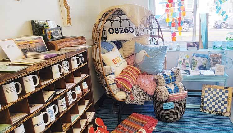
Coastal retailers can freshen up their add-on displays to enhance the customer experience and boost revenues. That Shore Store in Wildwood, New Jersey, displays a variety of mugs and greeting cards in an old mail sorting cabinet.
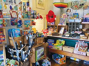
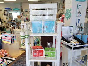
When customers visit That Shore Store in Wildwood, New Jersey, many are drawn to a display in the corner of the shop. An old mail sorting cabinet from the U.S. Postal Service holds mugs and greeting cards. That Shore Store Owner Irene Farrelly also placed a cozy chair stuffed with pillows and blankets next to the display to make customers feel at home. “It generates a lot of conversation,” she says of the display. “Maybe I wouldn’t come here to buy a mug, but now I’m staring at the mugs because of this piece.” Eye-catching displays such as this one can help seaside retailers sell add-on items in the store, impulse buys that can boost revenue. Kathy Cruz, co-founder of The Salvaged Boutique in Lakewood, Ohio, and founder of the Savvy Shopkeeper consultancy, says coastal retailers should carefully craft add-on displays in their stores. Creating strong add-on displays requires some time, but many can be implemented immediately and on a small budget, she says. She offers retailers six ideas for revamping add-on displays in their shops. 1. Add dimension.Retailers can fall into a pit trap of creating flat displays that lack dimension. If a display comes off as flat, customers will likely ignore the add-on products the retailer wants to promote. Cruz says retailers should consider ways to make displays pop so that they are more aesthetically pleasing. “We use barrels and line them up and wooden containers that balance and make for a real, vintage, old-fashioned feel — a country-store feel that is appealing.” — Jane Frost, Granite Hall StoreGranite Hall Store in Round Pond, Maine, offers a wide variety of gifts to customers visiting the store — T-shirts, coastal-themed home decor, kitchen items as well as candy and toys for kids. Jane Frost, a store manager at Granite Hall, says she ensures her displays match the old-timey feel of the store.  Granite Hall Store uses barrels and wooden containers for its add-on displays. “We use barrels and line them up and wooden containers that balance and make for a real, vintage, old-fashioned feel — a country-store feel that is appealing,” she says. When Farrelly opened That Shore Store, she decided to use items from home to hold displays as a way to give the store character. She notes that the old mail sorting cabinet display is particularly special to her. 2. Group items that complement each other.Grouping items that complement each other well within shop displays also could help to boost add-on sales. Cruz explains that if a retailer features a charcuterie board on display, the retailer should find complementary products to pair with the board. Granite Hall features a variety of rooms for customers to browse. Frost says the rooms each have a different focus — one focuses on stationery and greeting cards; another focuses on toys and gifts for kids; and another room features a book nook in a corner. Frost says she prefers that add-on displays match the focus of the room they’re in. At That Shore Store, Farrelly has a “rainy-day station” display that showcases add-on items that customers might want to buy on a gloomier day on the island — puzzles, games, paint by number and nail polish kits. 3. Simple signage.An aesthetically pleasing display might not be enough to encourage customers to take the next step to buy the add-on products. Cruz says retailers should make things as easy as possible for customers by including signage at the display. She says signage should encourage customers to make a purchase or offer unique information about the products to keep them browsing.  That Shore Store boosts add-on sales by grouping items that complement each other well. Cruz’s shop in Lakewood sells home decor and gifts, with a focus on helping customers refurbish their vintage finds. The shop also sells furniture paint for refurbishing projects. “Just because we know how to refurbish a bathroom cabinet doesn’t mean everyone knows,” she says. “We make a checklist that customers can grab and quickly see all things they need to work on that project.” 4. Create a bundle.Retailers should find ways to bundle items within add-on displays, according to Cruz. For instance, a coastal retailer promotes that “perfect beach bag” for customers in the display with all items needed tucked into the bag. Cruz advises against discounting bundled products on display, unless the items had already been on sale or aren’t in season anymore. “So many store owners have a lot of mindset roadblocks around pricing,” she says. “They feel like if the customer is going to buy four items instead of one, the customer expects to have a discount. That’s not the case. So many times, you can bundle and not discount it one bit. It’s a convenience factor for the customer, the no-brainer that they want more than the discount.” 5. Regularly refresh displays.Coastal retailers might not have the same customers every other week, but many stores do have loyal customers return semiregularly, even if that means once a month or once every other year. Although the add-on displays may seem fresh to tourists and infrequent customers, they can become stale to returning customers. Cruz says the frequency of loyal customers can help a retailer to determine how often to change add-on displays. “So many store owners have a lot of mindset roadblocks around pricing. They feel like if the customer is going to buy four items instead of one, the customer expects to have a discount. That’s not the case.” — Kathy Cruz, The Salvaged Boutique and Savvy ShopkeeperShe says, “In my store, we have loyal customers who come in at least every two weeks. For me, that determines the frequency of changing my displays. It doesn’t mean every display has to be redone every two weeks. But for me, every month, I move at least two displays or refresh them.” Farrelly enjoys rearranging her shop displays often enough that regulars are happily surprised with the new layout. “I change it a lot,” Farrelly says. “I’m Type A. I clean off a table and say, ‘Hmm … this would go better over here.’ I promote a sense that things are always changing.” 6. Capitalize on the cash wrap.Impulse buys sell well at the cash wrap. It’s that last spot a shopper stops when checking out. Cruz suggests promoting some add-on items by the register that might get lost in other parts of the store. Stick to selling smaller items around the cash wrap to avoid clutter and promote no-brainer impulse purchases, she advises. “It can be popular magnets that sell, or maybe it’s a travel-size sunscreen lotion that’s grab-and-go and easy that they can just pop into their bag.” For Granite Hall, Frost keeps a limit of just featuring one add-on item at the cash wrap. “This store is a little different,” she says, explaining that the store features a lot of penny candy near the register that is a big draw with the kids. “The cash wrap is covered in penny candy and can’t squeeze more in, except these little keychains on display.” Farrelly placed a small, unique-looking table with bins on top right by the cash wrap to promote add-on sales at That Shore Store. She says, “It makes you look at it and pick the items up while standing there.” Implementing changesMaking changes to add-on displays can be simple. Cruz notes that retailers can make many changes quickly and on a budget as well. “Any store owner, regardless of budget, can implement half of these immediately and it wouldn’t cost much,” she says. “Most of these don’t require a ton of effort.” She explains that if a shop owner wants to add a more eye-catching table to display products, the shop owner can try to find a nice table or riser at a thrift store. She adds that signage also can be printed at home for free, using online resources like Canva to make a sign that looks professional. When Frost began working at Granite Hall, she spruced up the store’s add-on displays by incorporating thrifted objects that match the store’s old-time vibe. “Our displays are really warm and appealing to people,” says Frost. “I think people feel a comfortable warmness when they come in here. We’ve collected over the years a bunch of wooden barrels and boxes for displays. It doesn’t need to take much.” |
