Wisdom for your windows |
| By Mary Williams-Villano |
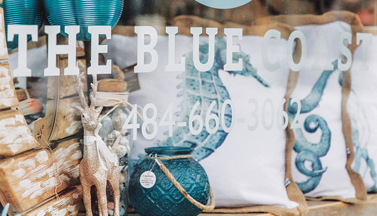
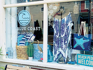
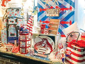
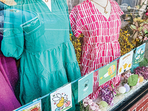
The front windows of your store can be a persuasive tool to lure customers inside. Just like “the eyes are the windows of the soul,” your store’s windows provide a glimpse at what’s inside your seaside store. It shows people on the outside what it’s all about. It’s a small opening into your shop’s “soul” or product selection, theme and atmosphere. And what passersby see behind that glass often determines whether they cross the threshold to see what is on the other side. “Window displays are extremely important for a seaside, coastal or nautical-themed store,” says Amy Meadows, owner of visual merchandising consulting firm Windows Matter. “They bolster your location’s general vibe and clearly communicate that your shop can provide merchandise that reflects the unique aspects of the region and the community that it’s in.” Crystal etched with the latitude and longitude of Martha’s Vineyard and other popular glassware featuring swimming fish are candidates for the window displays of Rainy Day, a Vineyard Haven, Massachusetts, gift store. “We make sure we have a good quantity of the items that we know visitors want,” says Cindy Higham, Rainy Day manager and “merchandiser extraordinaire” (so titled by her appreciative boss). She designs all the window displays. “We do try to promote the fact that we have Martha’s Vineyard items for tourists who want to bring back a gift from the island,” Higham says. Rainy Day doesn’t just cater to the tourist trade. “We’re kind of the local department store for the Vineyarders,” says Melissa Scammell, who co-owns the store with husband Bob. Residents and visitors alike enjoy the wide variety of beach and nautical-themed goods in the shop including home decor, bath and body and tabletop items as well as accessories like Spartina 449 bags and scarves. Making the most of themNot all storefronts are created equal, of course. You might have one big window to work with, several small windows or any combination in between. The owner of the Ocean Club shops so strongly believes in the power of windows to turbocharge sales that he custom-built all seven locations to have a multiplicity of them. One of the stores has 40, according to Ricky Lewis, who manages a Daytona location. Rainy Day’s exterior is mostly windows, giving its designer a big canvas to work with. “There are two large ones on the left-hand side as you’re facing the store,” says Higham. “On the right-hand side of the entrance, there’s another large window as well as some smaller ones on each side. The big ones are about 7 feet wide and 5 feet tall. We’re on a corner, and that has another big window.”  Blue accents in The Blue Coast’s, attractive window displays catch the eye of many a passerby. There are no shelves in the windows, so Higham employs tables and stools of varying heights for asymmetry and visual interest. And she doesn’t forget to use the air above the merchandise. “I’ll have items hanging there,” she says, “like the paper star lights and paper lanterns that we sell. They help fill in that void at the top of the window.” “She uses the entire space,” says Scammell. “It’s not just putting product on the base of the window, and that’s it.” Jennifer Kulikosky, owner of The Blue Coast isn’t quite so blessed. The 600-square-foot store is housed in an old brick building in an historic shopping district in Hamburg, Pennsylvania, “I wish I had three or four windows, but I don’t,” she says. “I only have one nice display window, maybe 10 feet high by 10 feet across, like a regular bedroom window.” But Kulikosky gets maximum advantage out of every inch. “I don’t do anything extreme because I don’t want to take up the space with extra decorations,” she says. “I’d love to have maybe beach balls in the window or different things like that, but I don’t have the room, so I really try to just keep it to my products.” Theme schemesThe first step is deciding what products to put in your windows. “Make a plan first,” recommends Meadows, “whether it’s going to be a seasonal plan, a holiday plan or one that’s item-specific, you need to map it out if only in your mind’s eye.” Themed windows are powerful, especially when they are centered around a gift-giving holiday such as Valentine’s Day, Mother’s Day or Christmas. An eye-catching display will snag customers on the lookout for a nice present. “My inspiration is usually based on a theme,” says Kulikosky. “I’ll do something that’s maybe more tropical one week, and I’ll feature the greens, the florals and the pinks with pineapples and flamingos. The next week it could be more nautical with a ship’s wheel and some whale tails and things like that.” Organizing a display around a merchandise “story” is another very effective technique. Every picture window at Rainy Day tells either a “color story, a product story or a time-of-year-story,” says Scammell. “In May we had one with a garden theme, showing all of our merchandise that goes along with that.” Higham rotates the stories. One week, a window will feature women’s wear; the next, she’ll swap those items out for kids’ clothing and toys. Being blessed with so many windows allows Rainy Day to dedicate a couple of them to permanent displays. One is all glassware, all the time. Another is a big corner window, featuring “giftables the locals wouldn’t buy,” says Scammell. “It’s set up to draw in tourists from that side of the street.” The Ocean Club stores, with five locations in Daytona Beach and Ormond Beach, Florida, have a more impulse-buy, souvenir-driven focus, so themes or stories aren’t necessary. “We just use what we have and put it into the windows,” Lewis. Some of the merchandise displayed will change with the seasons such as sweatshirts. “In the wintertime, we’ll put a lot more of them in the windows than we normally would. For Fourth of July, we might show some red-white-and-blue tank tops,” he says. Time for a change?Change is good, and frequent change is better, according to Meadows. “Ideally, your windows will change no less frequently than once per month.” “Every week I’m changing one or two of the windows,” says Higham. “With this many of them there is a lot of turnover.” Things can become disheveled if, for example, an employee takes an item out of the of the window display for a customer.  Rainy Day’s welcoming lobster display features products from all categories. “We want to sell the product, but the display’s balance gets thrown off when that happens. I tell employees that if they take something out, put something else in its place,” Higham says. Kulikosky refreshes her sole window “every week or week-and-a-half,” so no one gets tired of seeing the same-old, same-old. “It’s amazing how much people do notice the window, so it’s important to keep it fresh.” Window no-noAccording to Meadows, the one thing that you should never promote in your windows is a clearance sale. “Your windows should always show off your newest and coolest full-priced items,” she says — but not too many items. Another common mistake retailers make is cramming too much merchandise into a display, notes Meadows. The temptation to do this grows when there is just one window to work with and you want to make every millimeter of space pay off. “Without a doubt, the toughest part is knowing when to stop,” Meadows says. “Writers have editors, and visual merchandising benefits from editing as well. Tell only one story, have one theme, use one color.” The goal, as always, is to draw customers inside — entice them with just enough of a taste that they’ll want to see more. As Meadows puts it, “Don’t show me everything you’ve got or I’ll simply shop from the sidewalk.” Night lightSummer often means staying open later, well after dark. Meadows recommends keeping windows lit up even past closing time. It often happens that someone sees something in a window during a nighttime stroll and comes back the next day for it. Kulikosky has pendant lights hanging in her window and keeps them shining 24 hours a day. Meadows favors positionable track lighting that can be moved and adjusted as displays change. She also cautions, “Make sure that the window lights are on a separate circuit from the store’s lights.” Signing bonusTo complement window displays Meadows says it’s perfectly okay to use some signage in the interest of storytelling. You may wish to convey information about a particular item or the artist who created it. “Put that in a nice picture frame or sign holder,” she advises. “And make sure that the sign uses your logo-specific font wherever possible.” Ocean Club uses a lot of signs and makes sure they’re hard for keepsake-hungry tourists to miss. “We use neon colors,” says Lewis. “We have ones that say ‘Souvenirs, $1.99 and Up,’ and ‘Shark’s Tooth Necklaces, $3.99.’ Another one, with a display of beach towels, says ‘Buy One, Get One Free,’ and we have the same sign for the T-shirts. We put the signs on the outside of our windows.”  Rainy Day’s breezy coastal dresses are a window centerpiece, and its festive holiday displays remind customers to shop ahead for the season. Finding inspirationThere are plenty of places to look for ideas. “Inspiration is everywhere,” Meadows says. “Especially in trade publications, on Instagram and Pinterest.” Even so, perhaps you feel that this sort of thing just isn’t in your wheelhouse. There may be someone on your staff who has more of an artistic eye. Higham started out working in Rainy Day’s stockroom, then gravitated to sales, which eventually led to designing displays in the store, then the windows — and the rest is history. A well-executed window display is like a friendly, beckoning wave to a potential customer. With just a little effort, you can make yours say “Come on in! We’ve got some great things to show you.” |
