Checkout area dos and don’ts |
| By Mary Williams-Villano |
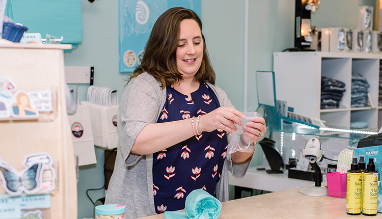
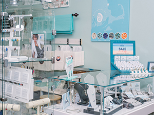
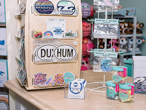
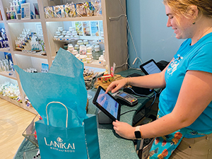
Maximize the cash desk and area around it to make a lasting impression and boost sales. As a seaside store owner, you’ve put a lot of thought into what merchandise you feature and what furnishings you use to display it. Your point-of-sale area or checkout deserves just as much attention. After all, that’s where the action is — it’s where all your hard work in curating, merchandising and advertising your wares finally pays off. The checkout area’s placement in your store, its general appearance and neatness all matter in terms of how the customer interacts with your merchandise and whether that results in multiple sales. It also has an important role to play in your store’s branding and in loss prevention. Where should it go?Why not place the cash desk right up front at the entrance and exit point (assuming there is just one door)? It seems logical. But this isn’t the best plan, according to Natalie Tan, Seaside Retailer columnist and owner of the consulting and training firm Retail Excellence, Burnaby, British Columbia. She says the ideal spot for your cash wrap or checkout is in the middle about two-thirds of the way into the store. “What better way to show customers the most product than by getting them to walk the perimeter of the store?” Tan says. “It’s the best location because it allows customers the most exposure to merchandise.” Sarah Nobles, owner of Mono Mono Boutique, Marshfield, Massachusetts, has her wrap desk in the center of the store against a wall. “When you walk into the store the door is in the front left and the checkout is in the center right,” she says.  Enticing jewelry displayed at Mono Mono Boutique’s cash desk encourages guests to make one last purchase. Photos: Anne Holden Brook Gramman, owner of Lanikai Bath and Body, Kailua, Hawaii, used to have her cash wrap in the front “so that when people walked in we could greet them. But now that we’re in a smaller location, we think it’s more important to use the front of the store to display product, so we put the checkout in the back.” Appearance matters The checkout desk should look inviting and not detract from the merchandise. “The two most important things are lighting and space,” Tan says. “I often find that cash desks tend to be dark. It should have good task lighting, nice and bright.” Counter height is important, too. According to Tan, it should be at a height that’s comfortable for a customer to set down a purse or sign a receipt. Sand ’n Surf in Santa Monica, California, has a standard-height one and a lower one for people in wheelchairs. Next most important to Tan is having ample space for impulse items and enough room for customers to stand and wait. “It’s typical to allocate 3 feet of aisle space between fixtures but that’s not enough space for the cash desk,” she says. “I would allow 4 to 6 feet of space in front of it and have your logo behind you.” Size matters, too. “When we opened 16 years ago, we started off with a 4-foot counter, but we’ve made it progressively longer through the years as we realized we needed more space for impulse purchases and also to do gift wrapping,” Noble says. The current counter is 8 feet long. As for color, Tan advises harmonizing with the rest of the store. She avoids red. “The counter itself is fairly neutral,” says Nobles. “All of it matches the rest of our displays, which are a white base with a wood tone like a butcher block color. I like to keep the shelving neutral so products stand out.” For Gramman, the checkout area’s appearance is part of her store’s overall branding. “The foundation of the Lanikai Bath and Body brand is sensory, based on the fragrances of the Hawaiian Islands, known for intoxicating aromas,” she says. “We’ve based our brand on our location, Lanikai Beach, and the products being as calm and refreshing as a day spent there so our color scheme is relaxing beach tones — the aqua blue of the ocean, the green of the mountains, the light brown color of the sand.” In harmony with that, the top of the cash desk and bamboo floors are sand colored, the shelves are whitewashed and the wall next to the cash desk is pale yellow. Aqua blue is the dominant color, repeated in the boxes, staff shirts and tissue paper that is free with every purchase.  Stickers, balms and bracelets are easy last-minute sells. Encourage those impulses If you’ve ever been to a T.J. Maxx store you’ve probably noticed how the checkout queue snakes you past an array of tantalizing lower-priced items like fun coffee mugs and socks. You can do the same thing on a smaller scale by placing impulse items on or near the checkout area. “The best location for impulse items is adjacent to where customers have dwell time,” says Tan. “There should be products within arm’s length of a customer waiting in line.” Gramman employs this strategy. “We keep some of our best-selling items on shelves on both sides of the checkout area,” she says. “We also have smaller, easy-to-pick-up items there like our lip balms, exfoliating scrubs and our new paper-soap thins.” At Sand ’n Surf, regular and impulse items tempt passersby before they even set foot inside the store. “We have these really big windows,” says Manager Yoni Molina. “Everything we have in the store is visible to the street so people can see it.” On the counter, a customer can find sunblock, surfboard wax and 4Ocean bracelets. “When customers are already buying something in the store like a T-shirt or a hat, when they come to the counter they grab the little extra stuff. That happens a lot,” she says. At Mono Mono Boutique, “We strategically place impulse items on and around the cash counter. Besides the jewelry we have a lollipop display and a spinner with nautical-themed stickers; we sell a lot of those,” Nobles says. The store’s impulse goodies include locally made lip balms. “Some of it is name-dropped with ‘Kisses from Marshfield’ or ‘Kisses from Massachusetts’ on it — really fun. Also hand sanitizer and a few different candies, including Rockstar Reef candy that’s made right here in Massachusetts and looks just like sea glass. Candy is a great impulse buy for us.” Mono Mono Boutique’s customers also can find the popular Dune, Lola and Moonglow jewelry lines at the wrap desk. “The jewelry needs to be at the front of the store so that we can help customers with it,” she says. “It’s in a case for security reasons — rings and things are too easy for people to just put on and walk out with.” Refresh rateHow often you refresh those impulse goodies depends on the type of customers, says Tan. “With a store in a tourist area, where people come in once or twice a year, you’re not as compelled to change them as often as a store that gets a lot of repeat business. In that case, you would want to change them out weekly.” Nobles reorders stickers constantly because they sell out so quickly. Gramman doesn’t let any moss grow on her impulse items, either. “To keep our customers engaged, we change things out about once a month and also when we get in new products or new fragrances.” You also can freshen the grab-and-go goods by simply shuffling their locations. Tan says the change can encourage sales of items that didn’t sell before. Nobles discovered this for herself when her greeting cards didn’t move. “We tried putting the card spinner in other places but people glanced right past it, but when we put them by the cash register they really started selling,” she recalls. “People buying a gift realize, ‘Oh, I need a card,’ and they’re right there where they can easily grab one.” Engaging customers That snaking T.J. Maxx impulse display is a great example of how to keep customers engaged while they’re waiting in line. “Because we’re smaller (800 square feet), we have tables going through the middle of the store,” Gramman says. “Anywhere you’re standing in line, you’re going to have something next to you, in front of you, on the side of you or in back of you to look at.”  Pretty printed bags at Lanikai comply with Hawaii’s rules and offer a custom takeaway. And because it’s a bath and body store, Gramman has testers out for everything she sells near the cash wrap. “They can pump the lotions, try the body butters, pick up the soaps and smell them — there are multiple opportunities to engage with our products while you’re standing in line,” she says. “We often see customers doing just that — opening up our bath salts and smelling them while they’re waiting.” A smaller, more intimate shop can also do something a big box can’t: talk up the products and demonstrate them. “We always have testers out by the cash desk,” says Nobles. “If we observe them trying the hand sanitizer — we carry a nice brand that is not like the kind you find everywhere else — we’ll start telling them about the product. Customers tend to fall in love with the scent, so we keep extra bottles there.” Keeping it clean Messy shops are one of Tan’s biggest pet peeves. She’s been in stores where employees are eating behind the cash desk and leaving the remains of their fast-food lunches out where customers can see them. “Nobody should be eating or drinking in full view of customers, period,” she says. “As soon as a customer enters, it needs to be stashed inside a cabinet or behind a door.” Dedicate a place for staff to stow personal items like lunches and handbags out of sight and keep cleaning products, scissors, tape and other supplies hidden too. As Tan puts it, “The checkout is the last impression you give your customers. Do you really want them to see your garbage?” Organization, placement and engaging displays with impulse purchases can help your store cash in on the checkout experience. So if you’re treating your checkout as a last stop rather than a centerpiece to drive sales, it’s time to think again. Put these checkout strategies to work to rig your store for improved safety, sales and brand identity. |
