Brighter days ahead |
| By Kristin Ely |
|
|
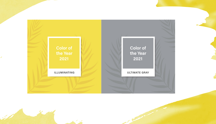
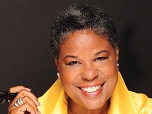
The 2021 Pantone Color of the Year selection brings a message of happiness supported by fortitude. Each year the fashion and design world waits in anticipation for the announcement of the Color of the Year from the Pantone Color Institute, which usually takes place in November of the preceding year. Retailers also look forward to the announcement. Once it is made, they must decide how much or how little of the color they want to introduce into their stores. They then must find products that use the trending color and place orders, hoping they’ve made the right selection and the right quantity. If it sounds complex, it is. And the 2021 Color of the Year is a bit more challenging, since Pantone broke from its 20-year tradition by selecting two colors instead of just one: Illuminating, a cheerful yellow symbolic of sunlight, and Ultimate Gray, a color of natural elements such as rock, stone and granite. Pantone describes the union of an enduring Ultimate Gray with the vibrant yellow Illuminating as expressing a message of positivity supported by fortitude. So how can a seaside retailer use these colors to evoke those feelings of strength and hopefulness in their customers? Patti Carpenter, a global trend ambassador and principal of Carpenter + Company/Trendscope is an award-winning creative director in globally sourced home decor, personal accessories, fragrance and gifts. She shares insights in to these two special colors and what seaside retailers need to know. Patti Carpenter on decorating and decorI think certainly that sunny yellow of Illuminating offers a great balance of contrast against anything that I normally think of from seaside stores, which usually will incorporate the wonderful coastal kinds of blues and a softer green. The idea of a sunshiny pop against those colors could be utilized in an accent pillow. If there’s room, you could try a piece of furniture like a chair. I think that could be really pretty. Lake and seaside stores generally have a nature inspired theme, so I think the yellow adds a cheery pop of color. With regard to the Ultimate Gray, if you move to the cooler side of that level of gray, it fits in nicely with the coastal blues. I’m talking about the lighter chambray sorts of colors all the way through to what we are calling Nearly Navy, which is just a brighter shade of blue that we see coming this season. In previous seasons, the blues have been very dark and very inky. We see them lightening up so the grays pair nicely. With the gray you can even bring in a larger piece like a sofa and then pop that with the blues as the accent pieces with throws and pillows. Patterning is another way that you could bring The Colors of the Year in. Those yellows often look great with a gray center against a floral or a gray leaf against the floral. You see the use of those two colors together a lot. I could see it in a printed pattern, I could see it in pops of solid, I could see it as accent walls, and depending on the space, a lovely curvaceous gray sofa or an L-shaped sofa with those yellow and blue accent colors together would be really pretty in a seaside space. The beauty for me in the Color of the Year is you don’t have to have that exact color that Pantone is projecting. It can be in that family. Patti Carpenter on apparel and accessoriesYou can have a lot of fun with apparel and accessories. When you look at the shows for this season, there is a lot of very intense color.  Taking a cue from your end customer will allow you to determine the range of the color that you want to work in, but also it gives you a sense of how much you want to invest within the price point. — Patti Carpenter You can play with gray with a pop on an accessory. You could wear a beautiful gray outfit and pop it with a yellow bag, shoe or jewelry. Or if you were bold enough, you could do the reverse and tone it down by putting on that pop of gray jewelry, or beautiful gray leather bag or great shoe. It works great in a floral pattern and a geometric pattern. We’ve been calling the yellow tones the Boisterous Brights and they're really full of optimism and really happy … the kind of things we are really looking for right now to raise our spirits. We’ve seen a lot of optimistic color coming through this season from designers. I really do think all of this speaks to the fact that our emotions have been down and it’s been difficult to find too much that you can call the silver lining. That is why one of the things that I’ve called out as a silver lining is these kinds of colors. Patti Carpenter on ideas for your storeI don’t think seaside retailers should go crazy with Illuminating. You want to put it in the places that you feel would be the most exciting, and that would be to put it in accessories. Go for that more mustard, warmer version of yellow, where it has a little more red in the cast. It looks beautiful against a range of colors. If you want a real pop you can wear it against black but of course it looks great with gray. It also looks great against any range of blue. It really freshens up herbal greens and looks great against navy. You can put it against any neutral color and it looks great. It can really be a way you can pop it and make those colors look fresh, but you don’t have to go overboard in the clothing pieces. People will usually take more of a chance on a blouse, a sweater or a top than they will on pants or a skirt. Most people already have a neutral bottom so they can freshen up their wardrobe with a great pop of color up near the face. It is always wonderful.
 Related Article: Sea Bags Maine brings The Colors of the Year into its recycled tote bags. Boisterous Brights can really lift someone’s spirits just by putting them on and that’s what a lot of us are looking for because we are feeling so disconnected. You always have to be mindful of your consumers and how far they are willing to go. Taking a cue from your end customer will allow you to determine the range of the color that you want to work in, but also it gives you a sense of how much you want to invest within the price point. With the gray it is a lot safer as it is a neutral that can go on forever, and the beauty of this gray is that it is a really beautiful midtone. It’s misty, light and airy. Gray is the classic, it is the yellow that is an exciting sunshine color.
|

