Windows that wow |
| By Megan Smalley |
|
|
Design memorable window displays as a way to entice prospective customers into your shop.
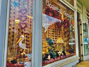
When it comes to retail storefronts, first impressions happen in seconds. Shoppers often use window displays to decide whether they walk into your shop or a competitor’s shop not far down the road. Bob Phibbs, CEO of The Retail Doctor, has managed The Retail Doctor consultancy for more than 30 years. Throughout his experience in retail, he has seen what works and what doesn’t work with regard to enticing foot traffic through window displays. According to Phibbs, prospective customers generally walk past a store if the window display is too boring or almost identical to what’s displayed in other stores nearby. Seaside retailers risk losing out on potential sales when they fail to make their window displays pop. “We judge people by their clothes; we judge stores by their windows,” Phibbs says. For Kate Simpson, who owns Cerulean in Cape Cod, larger windows serve as a great advertising tool. When she had the opportunity to relocate her store from Warren, Rhode Island, to a new storefront in Sandwich, Massachusetts, this past fall, a larger window was a big selling point that encouraged her to make the move.  Julianne's Coastal Cottage relies on small changes every week to make windows pop.
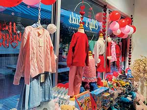
“I love having big windows, especially something with a ledge on it so I can build onto it,” she says. “Windows have always been a big thing for me. It’s what I look for when I lease a space. Window displays offer a picture of what is in the shop. It’s usually a way to get people inside.” Phibbs adds that designing effective, engaging window displays is “an underappreciated art” that retailers sometimes treat as an afterthought. He notes that he’s seen too many retail windows stuffed with chaotic merchandising or thoughtless placement that fail to connect with passersby. “Without a clear purpose of why you put what you do in a window, nothing stands out to the shopper to want to know more,” he says. “Even worse, the passersby say to themselves, ‘This isn’t for me.’” Freshen with frequencyWindow displays aren’t meant to remain stagnant; even the best window designs need to change every so often to appeal to repeat customers. Both Elly’s Gifts and its sister store, Elly’s Kids in Emerald Isle, North Carolina, change displays just about every week to keep things fresh. Elly’s Gifts features coastal-themed crafts, gifts and souvenirs, while Elly’s Kids offers coastal and beachy apparel, accessories and toys for kids. Vivienne Mayer, a supervisor at Elly’s Kids, generally oversees window displays for Elly’s Kids and says she likes to adjust colors and products in the window display every week or so and then make bigger adjustments to the theme with changing holidays and seasons. Michelle Frakes, owner of Julianne’s Coastal Cottage in Mount Dora, Florida, has a similar approach, making big changes to the window displays every two months but making small adjustments every week in between. The seaside retailer carries a wide variety of beachy and coastal gifts as well as Florida-based foods and candies. For Cerulean, changing the window display monthly works well. Simpson says she might change the display more frequently if needed for a certain holiday or occasion, though. Phibbs says the frequency with which a store should change its window display varies depending on the location and time of year. Regularly changing window displays during the busy season is important for catching the attention of people vacationing in town for more than a week, too. “In high season, I would try to change the window display every week,” explains Phibbs. “That’s when you deal with people coming in for 10 days at a time.” He says he was surprised when he was staying in the Honolulu area and passed a beautiful bathing suit store. “But in those 10 days, the same suit stayed in the window. I thought, ‘Are you nuts?’ The store had 10 opportunities to show people 10 more items. The more you can make it different and fresh, the better,” he says. Consider color, scale, brandSeveral elements help a display to captivate customers, including color coordination, scaling and detail orientation. When picking a window display’s color scheme, Phibbs advises sticking to just two or three consistent colors to tie everything together.  Focusing on one or two main colors draws the eye at Elly's Kids in Emerald Isle.
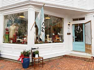
At Elly’s Kids, Mayer says she likes her window displays to focus on one main color and use one or two other colors as accents to help the display to pop. For instance, she might design a window primarily full of pink apparel, but she’ll accent with white or red accessories or toys. If the window features mostly neutral-colored apparel, she likes to accent those tones with something brighter like a bright red balloon or toy. On at least one occasion, a single- colored window display helped Elly’s Kids to draw in foot traffic, though. Mayer says that display featured white balloons, white apparel along with tan pants and shorts on the children’s busts. Although it was fairly monochromatic, the display prompted people to come into the shop. Phibbs also advises against just stuffing window displays with as many products as possible. Instead, he says, windows look best when the items in the display are thoughtfully sized and scaled to showcase a story. Mayer says she’s mindful about featuring different sizes and options in her window displays at Elly’s Kids. Instead of using the window to highlight three different boy outfits, she typically tries to have one boy outfit, one girl outfit and one baby or toddler outfit. “I stagger the outfit sizes so it breaks it up,” she says. “Part of the reason why I do a size 8 boys, a size 6 girls and a size 6-12-month baby article is so you can see that there’s movement in the window and outfits.” “When I first bought this store a year ago, I assumed that you dress the window according to the season. But I learned that’s not always necessary,” she says. “When you get cool merchandise in, you put that in the window.” Planning makes perfectPhibbs says the best window displays don’t build themselves overnight, they often take days or even weeks of planning in advance.  The windows at Cerulean in Cape Cod serve as a fantastic advertising tool.
“Think about if you were making the pie for your family’s Thanksgiving — will you try to make it an hour before dinner, or do you want to give care to it?” he says. “I don’t think you can complain that you’re not attracting enough people to your store if you’re not willing to put the work in.” Mayer adds that seaside retailers also shouldn’t be afraid to be flexible and open-minded about what they feature in their window displays. “Put something together outside of your comfort zone,” she says. “Sometimes it’s better to work out of your comfort zone. I’m not going to pick browns, oranges and yellows, but those colors look great together for a neat fall table. So don’t just stick with what you think is pretty because not everybody thinks that’s pretty.” Making those types of calls takes a lot of consideration and planning, so Mayer says retailers should always try to draw a plan for their displays before putting them together. She concludes, “As long as you have a plan and an outline, that will help everything fall into place so much easier.” |
